
Room ideas
Wall art for small living rooms: choosing the right print
Choose wall art for a small living room without crowding it. Compare one statement print with a pair, test sizes above a sofa and coordinate colour.
By Ministry of Posters · Updated
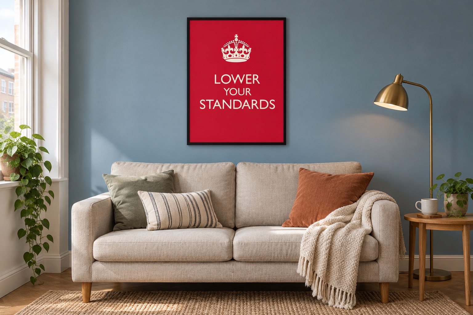
A small living room can still have a strong point of view. The trick is to choose the place and the message first, then test a size that fits. More wall art is not automatically more character. Sometimes it is simply more wall art.
Pick one place to make the statement
Look at the room from the doorway and from where you normally sit. Decide where a print would be most enjoyable: above the sofa, on the wall opposite it or beside a reading chair. Check what already competes for attention, including a television, shelving and patterned furnishings.
A single clear focal point can be a useful starting arrangement. This does not mean the room must be minimalist. It means you can choose one print you enjoy without feeling obliged to fill every remaining gap.
Do not assume small rooms need tiny prints
A small print can be right for a narrow wall or a shelf display, but it can also look lost above a sofa. A larger print may work if there is enough clear wall around it. Neither choice makes the room physically bigger; the aim is an arrangement that feels balanced and is easy to see.
Measure the available wall and make paper outlines of the sizes you are considering. Look at them while sitting down as well as standing. Check the space above the furniture and beside any wall lights.
The A-series size guide compares dimensions in inches and cm. Confirm the offered size on the actual product page, and allow for the outside dimensions of a frame where necessary.
One print or a pair?
One statement print keeps the decision simple and can work well when the room already contains books, plants or patterned cushions. A pair may suit a wider wall or let you combine two messages, but remember to measure the full arrangement, including the gap.
For a pair, connect the designs through a colour, frame finish or similar visual weight. Matching everything is optional. Being able to enjoy both prints is the point.
If you are trying a gallery wall, arrange paper templates first. Leave enough separation for each design to be read, and consider starting with fewer pieces so there is room to adjust.
Use colour deliberately
The mockup above uses a red Lower Your Standards poster against a muted blue wall. The print supplies a clear colour accent while the sofa and other furnishings remain quieter. The message is dry; the decorating ambition need not be.
You could pick up a colour already in a cushion or choose a contrast that makes the artwork stand out. Check the whole product image, including its background and border, rather than choosing from the wording alone.
Public Instruction offers sign-inspired typography designs. For a household joke involving the resident animal, explore pet-inspired prints.
Check the view and choose the format
Read the message from your usual seat. Longer wording takes more attention than a short headline, particularly when the print is across the room. Check for reflections from windows and lamps before making the hanging position permanent.
Choose a poster if you want to use your own frame, or a framed print if you prefer to order them together. Open the size and materials panels on the product page and confirm the selected option. Room mockups show an idea for styling, not a measured installation plan.
For more help choosing words, colours and a small group of prints, see our typography guide. A compact room does not require lower standards. Just a little measuring before the official purchase.